Some blog design changes for easier reading
As regular readers know, the Texas Supreme Court is on its summer break. The fall calendar is set, and the next conference of the Justices is not scheduled until mid-August.
With my SCOTXblog time, I’ve been working on a new project that I hope to launch by the end of the summer. Yes, it’s also related to the Texas Supreme Court; I will announce it on the blog when it’s ready.
Along the way, I’ve been learning a few programming tricks. With one of them, I’ve updated SCOTXblog so that its layout rearranges as you make your browser window narrower or wider.
But these improvements do not, unfortunately, show up in Internet Explorer. My apologies to the quiet majority of my readers who use that browser from work — there isn’t any easy fix. You will see the standard three-column view.
Those of you using Firefox (25%+), Safari (10%+), or Chrome (5%+) can now see a few alternate views by resizing your browser window:
-
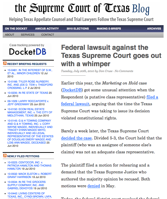
A slightly narrower view, for when you have several windows open. This drops out the left column so you don’t have to struggle to read the text. 1
-
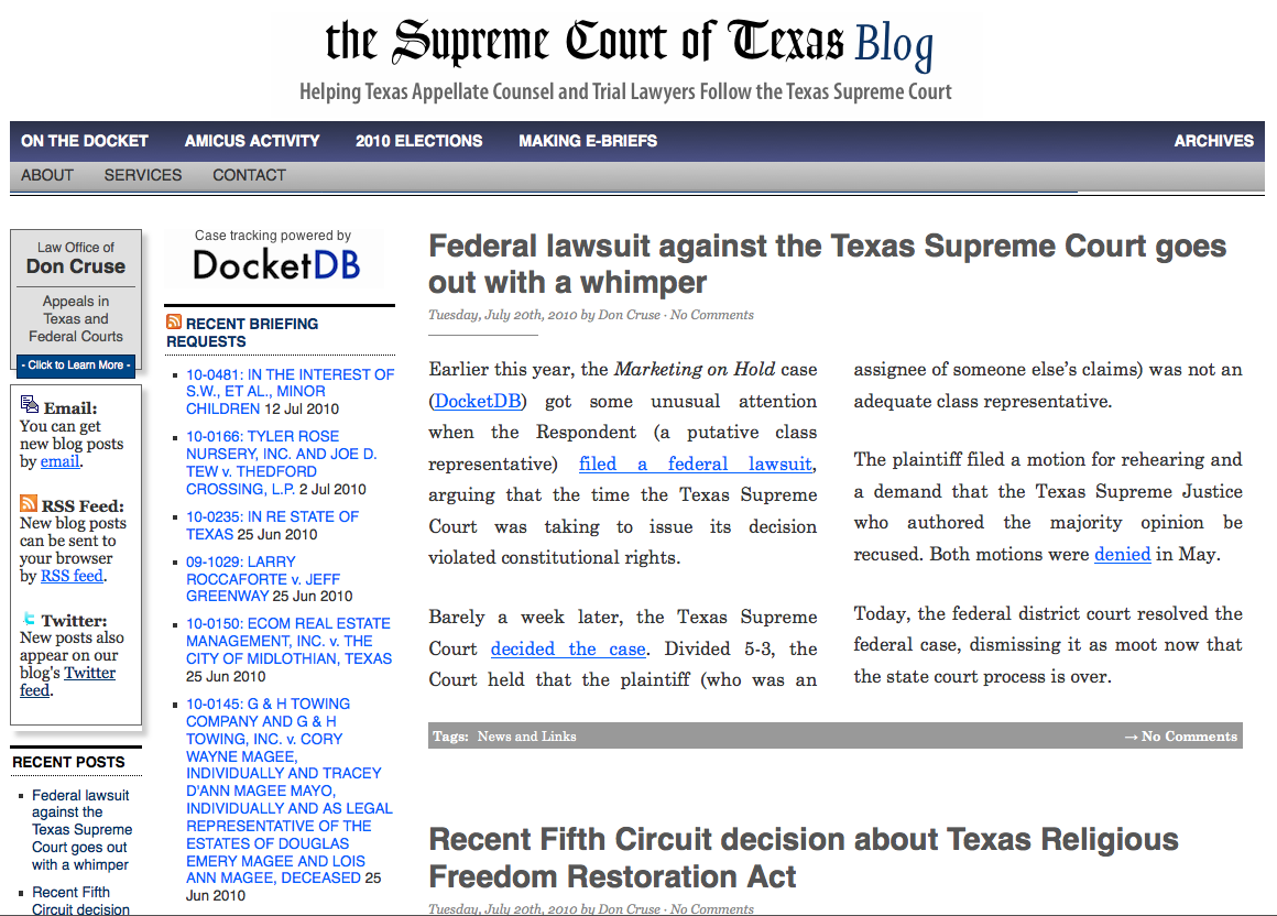
A slightly wider view, for when you’re on a widescreen monitor. This makes the sidebar text bigger and (on Safari, Chrome, and Firefox) formats the articles into narrower columns.
-
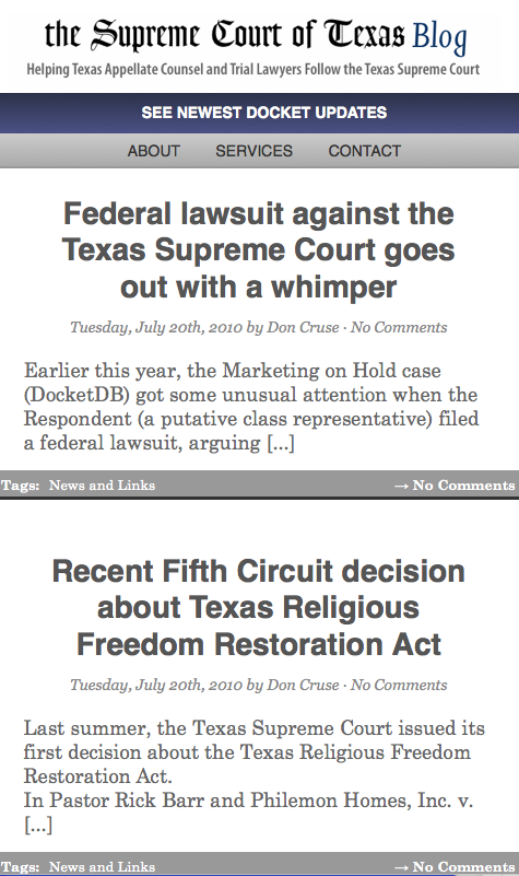
A mobile view that focuses on headlines, when you make the screen narrow enough. This should show up on your iPhone. 2
As always, please let me know if these changes cause you any problems.