Detailed Texas Supreme Court voting statistics for 2010 term now on DocketDB
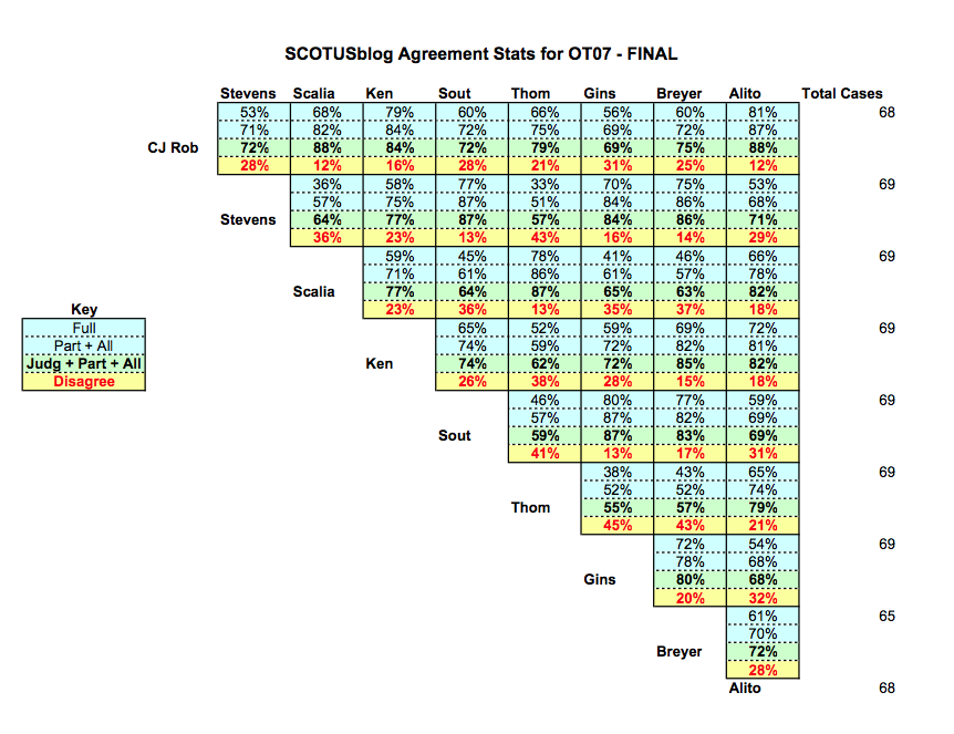
You may have seen the “stat pack” offered by SCOTUSblog with voting statistics for the Justices.
Its wedge-shaped voting chart is familiar — and, for a time, it became a staple of Texas CLE programs as well. Following that path, I prepared some of these charts for an Austin appellate bar program in March.
The experience made me more conscious of two weaknesses in these charts.
First, the author often must choose what universe of cases to show — all opinions, all signed opinions, only divided opinions. The easy choice is “all opinions,” but it gives very little signal compared to noise. In other words, the unanimous opinions push up the percentages and hide disagreements in the more challenging cases.
Second, even with a background in economics and math, I was bothered just seeing a percentage showing that two Justices agreed 60% of the time. That top-level statistic is fine for people who just want to make a broad-brushed assertion about the general makeup of the Court. But as an advocate I wanted to know which cases led to that disagreement. That is where a serious advocate can start to learn how two Justices might approach a problem differently.
Announcing DocketDB voting tables for 2010
I finally have a set of voting charts that make me happy. The basic layout should look familiar.

But this chart is dynamic — you can choose to focus on the scope of cases you want (all opinions? only signed opinions? only those with a dissent?):

You can also choose the types of disagreement you want to highlight (disagreements in opinion? or only in judgment?):
And the real kicker for me: You can click on a cell in the table and drill down to a page that shows — for each pair of Justices — the specific cases on which they agreed in the opinions, agreed in the judgment, or did not agree in the judgment.

These detail pages show keywords about each case (when they are present in DocketDB). You can also navigate directly from here to each relevant opinion that led to the split.
Where to find the voting charts
The dynamic 2010 Texas Supreme Court voting analysis charts are available to anyone who has registered for DocketDB. (If you registered before and have forgotten your login, you can get access through this link . If you haven’t registered, you can register here
Once you’ve logged in, look under your “Research Tools” menu in the top left of the menu bar. You should see the new “Vote Analysis” option.
I’ve always reserved some of the DocketDB features for the professional subscribers who help support the site financially. With this set of voting tables, I have reserved the data for 2006 to 2009 for those supporters.
For the future…
I haven’t yet decided on a next step, but I’ll mention two further enhancements that could be built on this same set of data:
-
Choosing cases by subject matter, rather than a whole term. Back in March, I was asked if it was possible to look just at the cases involving a particular issue. The answer now is that, yes, it is possible. A chart can be made for any set of cases, defined on any characteristic in the database. (The trick is defining those sets of cases, or creating a tool that lets users create their own sets of cases.)
-
Graphic representation of voting patterns. I’m thinking of the slides that I presented in March 2010, showing the relative voting position of the Justices in 5-4 cases. (Here’s the slide (PDF) I made for the U.S. Supreme Court, to give you an idea.) The data that powers today’s dynamic voting tables should be able to power those same graphics. (I used a different computer to build those charts, and the trick here would be folding this into the main DocketDB code in a way that works for the web.)
Those two enhancements could be combined to show, for example, a graphic representation in how the Justices vote on cases about statutory construction, or civil procedure, or medical-malpractice cases.
As always, I very much welcome your input about what new features would be helpful to your practice.